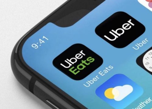
Uber has done away with the logo it unveiled two years ago in favor of a new wordmark version that simply uses the company’s name. Uber has also redesigned its mobile app, and has changed its mission statement from “Make transportation as reliable as running water, everywhere, for everyone” to “We ignite opportunity by setting the world in motion.”
The previous logo is being abandoned because consumers weren’t regularly connecting it with Uber, the company told AdWeek. Uber says it even found that some drivers turned the company-supplied decal inside out (since the name was on the flip side).
The wordmark in Uber’s new logo uses a custom typeface called “Uber Move.” It’s supposed to echo similar sans serif fonts used for transportation signage around the world, according to AdWeek, and also saves the company from paying licensing fees. Custom typefaces have become popular at top Silicon Valley companies — Apple, Google, and Netflix, for example, have all adopted special-made fonts in recent years.
“We’re excited to unveil a new, simplified logo for the Uber app that brings back the U, is easily recognizable, and is scalable across the 660 plus cities we serve,” a spokesperson for Uber said in a statement. The company’s new logo will hit the Uber and Uber Eats apps today, and other changes to Uber’s design language will roll out over the next few months.
Earlier this week, Uber also appointed its first chief marketing officer: former Coca-Cola executive Rebecca Messina. The company also recently announced a new suite of safety features. All these moves show that, even after a year under new CEO Dara Khosrowshahi, the company is still plugging along at the task of reassembling the pieces of its reputation, which had been left in tatters by founder Travis Kalanick


Comment here